Japanese automaker Suzuki has introduced its first new logo since 2003, featuring a flatter, non-chrome design. The new emblem follows a trend among automakers of adopting simpler 2D logos. It will debut on concept cars at the Japan Mobility Show 2025 in late October.
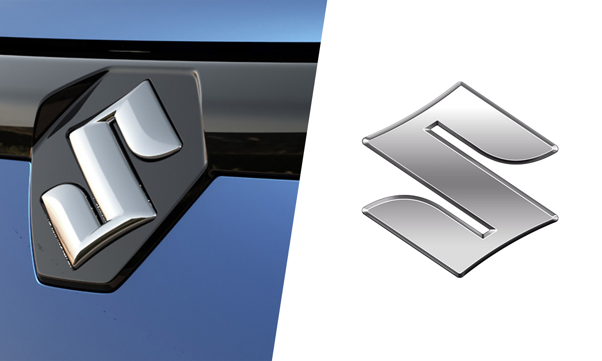 |
The new Suzuki logo (right) and the old logo (left). Photo: Carscoops |
The new Suzuki logo (right) and the old logo (left). Photo: Carscoops
The new logo retains the iconic "S" emblem, largely unchanged since 1958. The updated design features a flat, smooth typeface with sharp edges along its contours. The shiny chrome finish has been replaced with a bright silver resembling matte aluminum. According to Suzuki, the new logo uses more environmentally friendly materials.
The appeal of the digital age is that simplified 2D logos tend to display better on screens, where brands are increasingly visible. However, some argue that flattening these emblems loses the depth and physical presence they once held in the real world.
Suzuki is not alone in this change. In recent years, numerous manufacturers, including Volkswagen, Audi, Nissan, Mazda, BMW, Mini, Volvo, Kia, Opel, Renault, Peugeot, Aston Martin, Bentley, Lotus, Jaguar, and Lamborghini, have adopted this minimalist approach.
Suzuki confirmed that the new logo is part of a broader brand identity campaign with the slogan "By your side". It will first appear on concept vehicles at the Japan Mobility Show 2025.
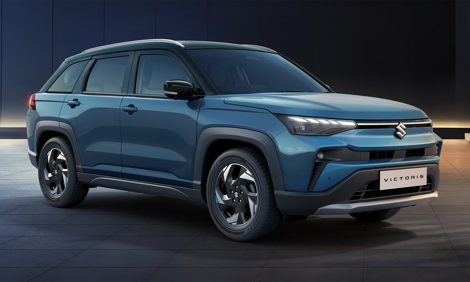 |
The Suzuki Victoris, the first commercial vehicle to feature the new logo. Photo: Suzuki |
The Suzuki Victoris, the first commercial vehicle to feature the new logo. Photo: Suzuki
From there, the new logo will gradually appear across Suzuki's entire global product line. Because the logo's proportions remain unchanged, it can be seamlessly integrated onto the grilles and tailgates of existing models without requiring design modifications. The newest vehicle in Suzuki's lineup, the Victoris SUV, was recently introduced in India.
Minh Vu (Carscoops)


